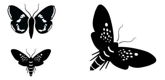
This has been a nice little logo design job from the ‘Pure Arts Group’. The client wanted a moth within their logo. I too like moths, but I’m certainly no lepidopterist. So if you are one and you see this, please don’t write to me with anatomical criticisms! This was more about creating an overall impression of ‘mothness’ rather than it being an anatomically correct drawing or it being readily identifiable as a species.
I was instinctively leaning towards something that was classically moth shaped, but of course when one starts looking there are several ‘classic’ shapes. The client originally gave a me photograph of a moth, that appeared have what I would say was more what one might recognised as being butterfly shaped rather than moth shaped. It was also requested that the moth have four wings and that the logo should not be too ‘fly’ like. After a few versions tweaks, emails and many cups of tea later, the client settled for logo on the left (seen here without colouring). The client is very happy with the result, however, the lepidopterists amongst you might want to look away now.
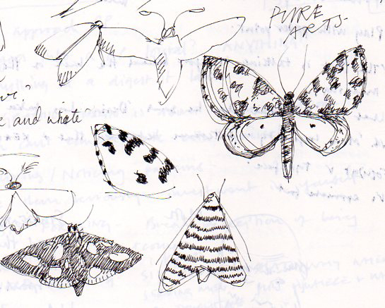
Some stages of the visual design process can be seen below.


Following some subtle tweaking of antennae and legs, the next round of tweaks involved the introduction of colour as well as the modification of the four-winged moth. Grey and cream were the colours requested, along with a some means of softening the design and a version without spots. A little bit of kerning to improve the type and the job was largely done.


