Little White Lies magazine
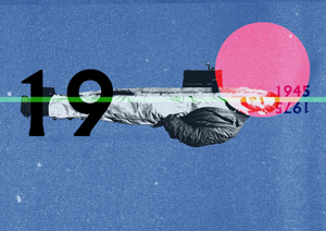
 ast week I took my HND and BA Graphic Design students to the ‘AOI Illustration Awards 2013′ held at Somerset House. Overall, I found the work of this year’s exhibitors as equally impressive as last year’s. The awards are “the only independent jury selected illustration competition in the UK…that recognises exceptional work ” and which promotes “illustration as an essential contributor to global visual culture.” The exhibits certainly were exceptional and I believe these works addressed that latter aim too.
It was a genuinely refreshing exhibition with some unexpected approaches. For me, most noticeable was the absence of some of the clichéd styles of illustration that have hung around for some while now. This was a strong and mature show. By that, I’m not just referring to the high quality of the work in terms of technique and compositional skills but also its content. The work was genuinely engaging and that’s arguably been missing from certain genres of illustration for a while. Before anyone takes umbrage to the last comment, I should couch that by acknowledging that there’s room for all types of illustration, and that illustrators often have to do whatever they can to eke a living. I simply felt that it was refreshing to see illustration with substance dominate this exhibition.
Many of the pieces were placed into context to show the illustrations functioning as intended. It is so important for students of illustration to see illustrations working as pieces of visual communication, supporting a text rather than just pieces of image making. An image is not an illustration until it illustrates something. That might sound like I’m stating the obvious, but I am surprised at how often I find myself reminding students to consider that.
Most of my favourites came from the shortlisted pool; and of particular interest were the lively and well observed sketches and drawings of commuters by Steve Wilkin, captured with great character and then set within text as drawn without apparently being tweaked. Again, it was good for students to see that illustrative solutions often reside within the sketchbook. As a process to learning illustration, there can be a stultification of the work when taken from the freedom of the sketchbook and then overworked into what the student might view as a neatly polished final. One can ‘kill’ an illustration with too much tweaking. Knowing when to leave it alone is a skill in itself.
One of my favourite works had to be Sara Ogilvie’s illustrations for the Folio Society’s ‘The Box of Delights’ by John Masefield. I found these simply engaging and intriguing. They are illustrations to be pored over which is exactly what I did, returning to look at them several times.
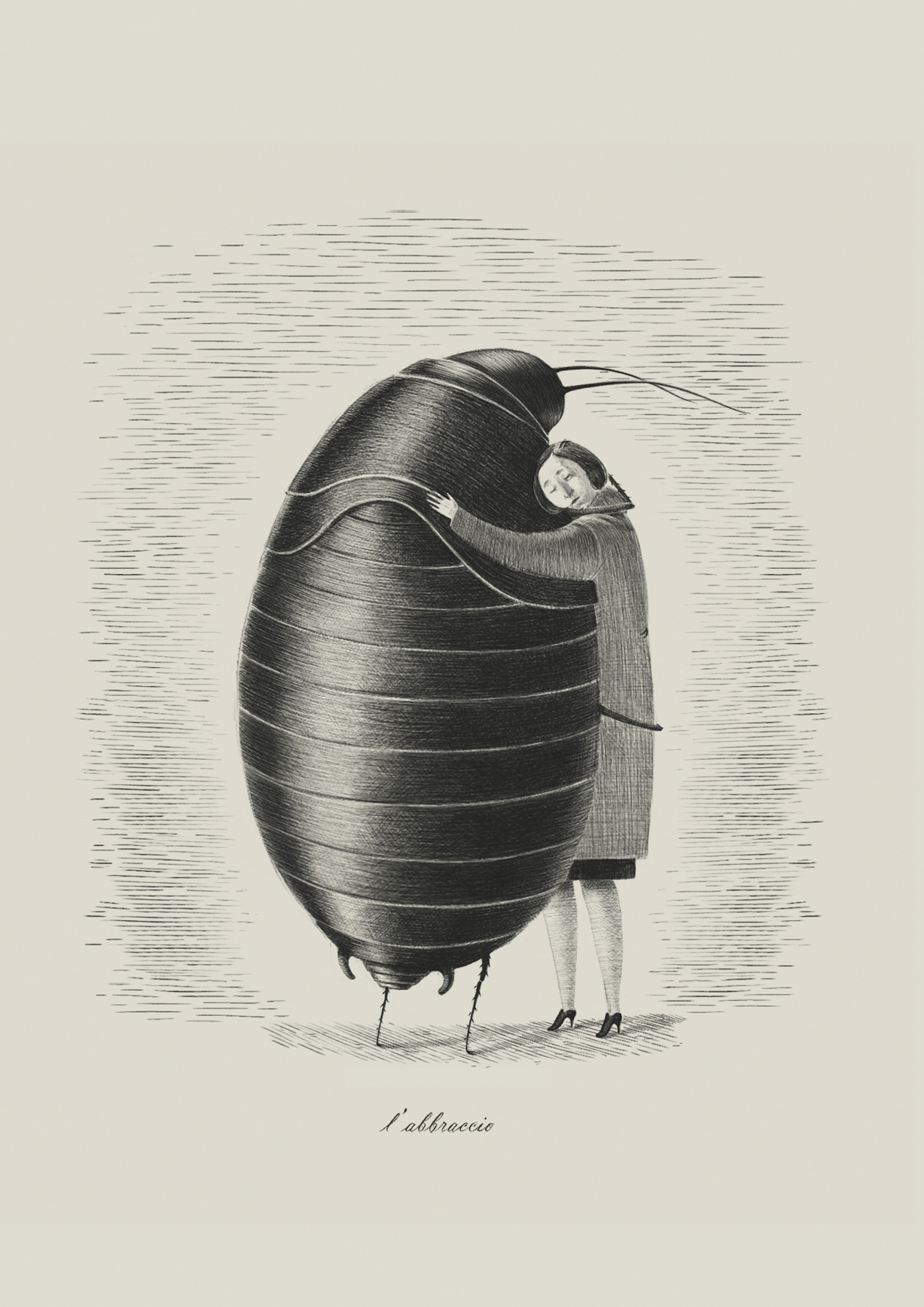
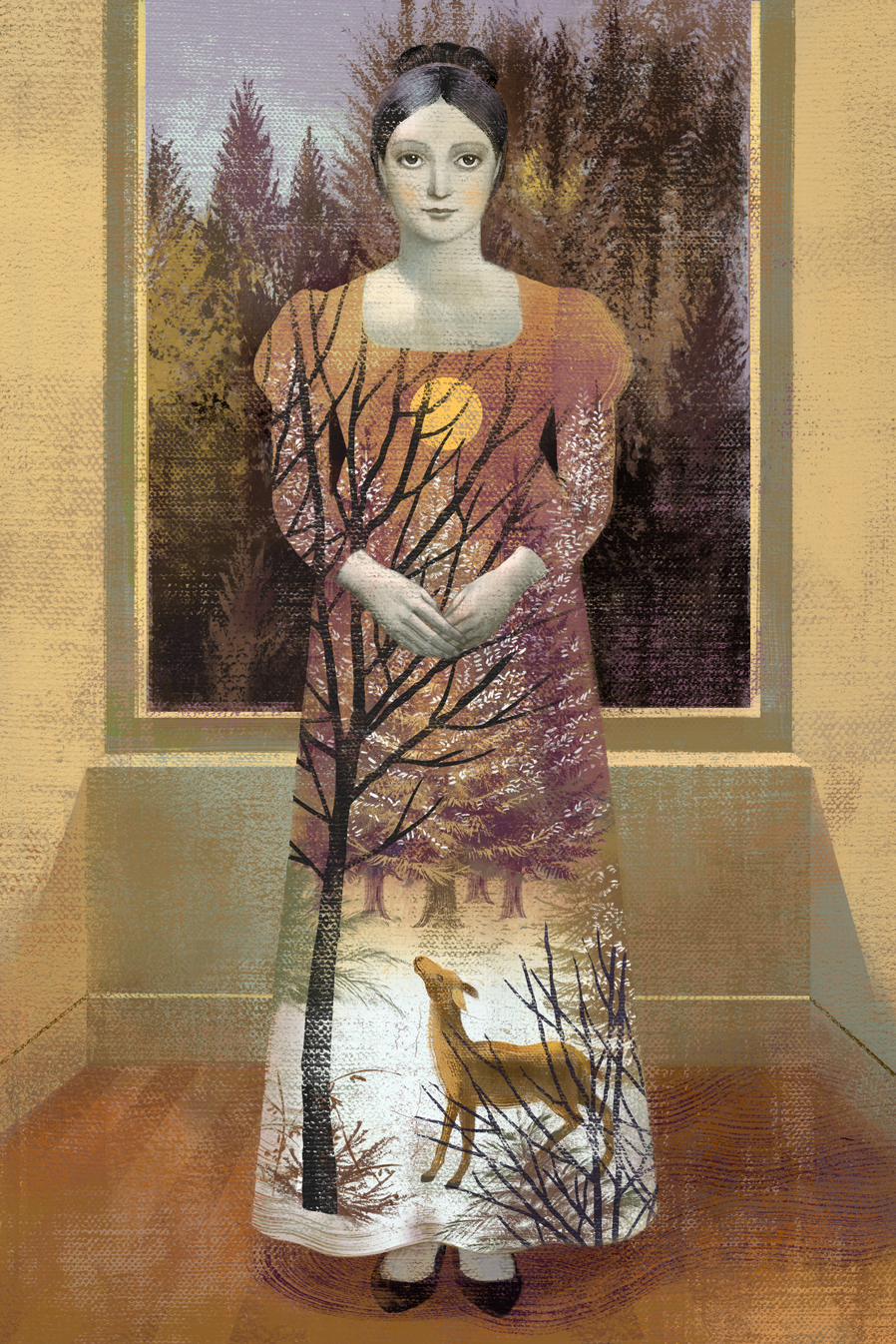
Also intriguing were the beautifully drawn works of Jun Cen (see below). These graphite book illustrations possessed a slightly surreal, dreamlike quality. The images gave me the sense of having stumbled into a scene whereby one has to quickly determine what’s going on. The illustrations were sensitively drawn, yet the dark graphite gave them a density and contrast that creates a powerful presence. It would have been great to have seen these set within their intended book. (Perhaps I missed this if they were.)
Some of the work reminded me of the styles that were familiar to me from being a pre-digital student of illustration—22 years ago in my case—when many of us at my college would use just gouache or acrylics to produce painstakingly detailed works. I’m thinking particularly of Simon Bartram’s incredibly detailed acrylic works for the children’s title ‘Bob, The Man of the Moon‘.
I thoroughly enjoyed the exhibition and already look forward to next year’s offerings. My students on the other hand, seemed to favour the appropriately titled ‘graphic art’ of ‘Pick me up’, the annual exhibition that also takes place at Somerset House. Perhaps because it’s more trendy, for want of a better word? However, I got the impression that they felt that the standard of work produced at the AOI Awards was a product of skills unobtainable to them, but they appeared not to consider the enormous journey that each illustrator has likely taken to attain such standards. With that in mind, I think perhaps the visit was in itself a good lesson in highlighting the importance of sustained practice, particularly as we live in such a culture of immediacy.
The category winners can be seen here, and those shortlisted here.
edition of playing cards Odd Bodds

from the Folio Society edition of Eugene
Onegin