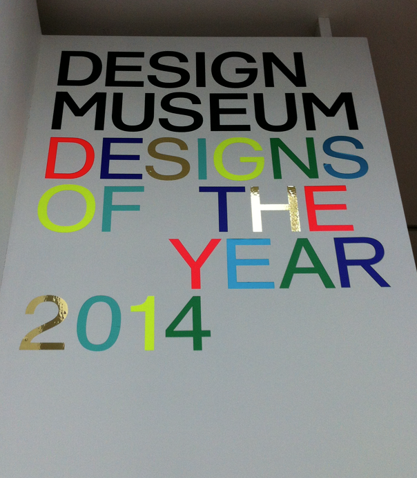
 aving been at the briefing for the new ‘Design Factory’ at the museum’s tutor brunch—a briefing for an annual Higher Education competition—my colleague and I were then invited to take a look at the current exhibition: Designs of the year 2014. As ever, the work was a mixture of the fun, the utilitarian, a mixture of the two and as one might expect the design there were highly innovative solutions to very specific problems. I felt that this was the best collection to date and wanted to share just a few of my personal favourites.
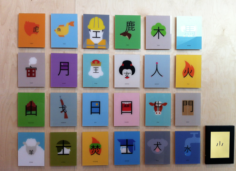
‘Chineasy’, a design by ShaoLan Hsueh and illustrated by Noma Bar is a illustrated method of helping people learn Chinese. Bar’s illustrations incorporate the Chinese characters helping make the connection between glyph and visual definition. It’s beautifully simple concept and following tests has been further developed into both a book and animation.
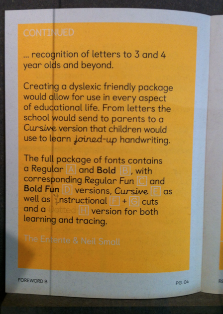
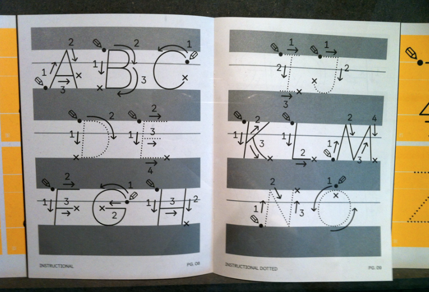
As someone with a lifelong fascination with handwriting and the construction of letterforms, I was particularly drawn towards Type Family commissioned by the primary school head of Castledown Primary School, Neil Small and designed by Colophon Foundry designers, Anthony Sheret, Edd Harrington and Rupert Dunk. The requirement of the font was make reading easier, particularly for dyslexic children. The typeface has been used as the school’s signage and another developed to assist with the learning of handwriting. Given the frequent talk of handwriting’s demise I was glad to see that it’s future was still being considered within the most innovative and forward thinking design solutions.
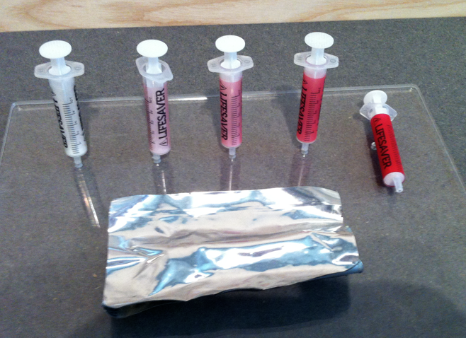
The next design I felt was pure genius. Dr David Swann designed ‘A Behaviour Changing (ABC) Syringe’ This syringe is designed to help deter the reuse of syringes among those who are at risk of doing so. Once a syringe has been taken from its packaging it and exposed to air it begins to change from clear to red. If removed from its packaging it is unlikely to remain sterile for long. This at least gives the potential user a visual indication of its potential sterility.
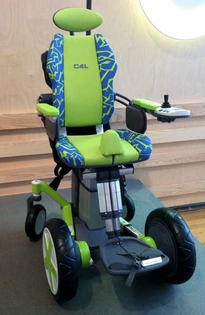
There were many great designs here; too many to put into this post. There was the Chair 4 Life, a wheelchair that can be modified and adapted to suit the requirements of a growing child. One of my favourite illustrators, Chris Ware had a piece here. A graphic novel about life in a building.
